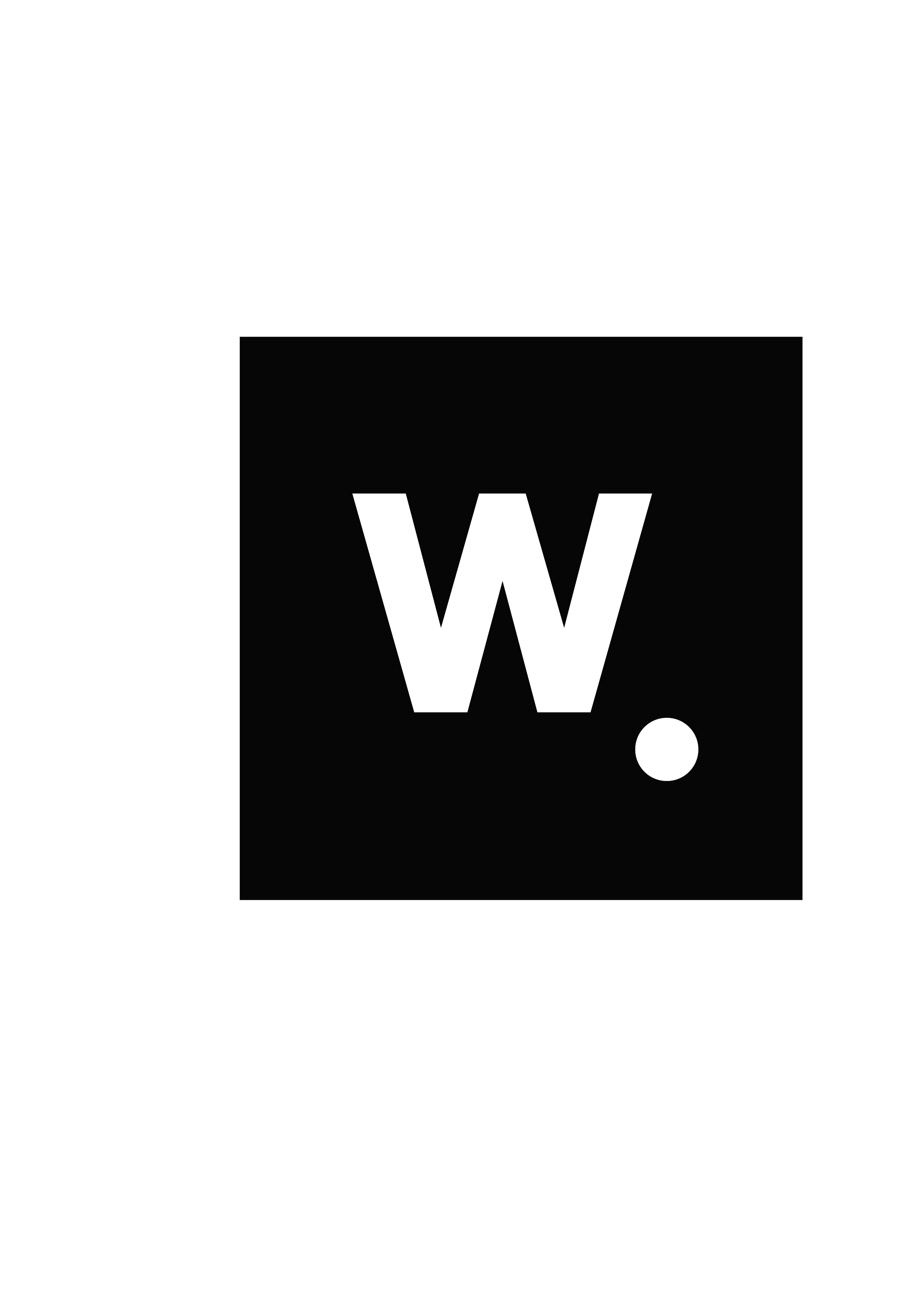
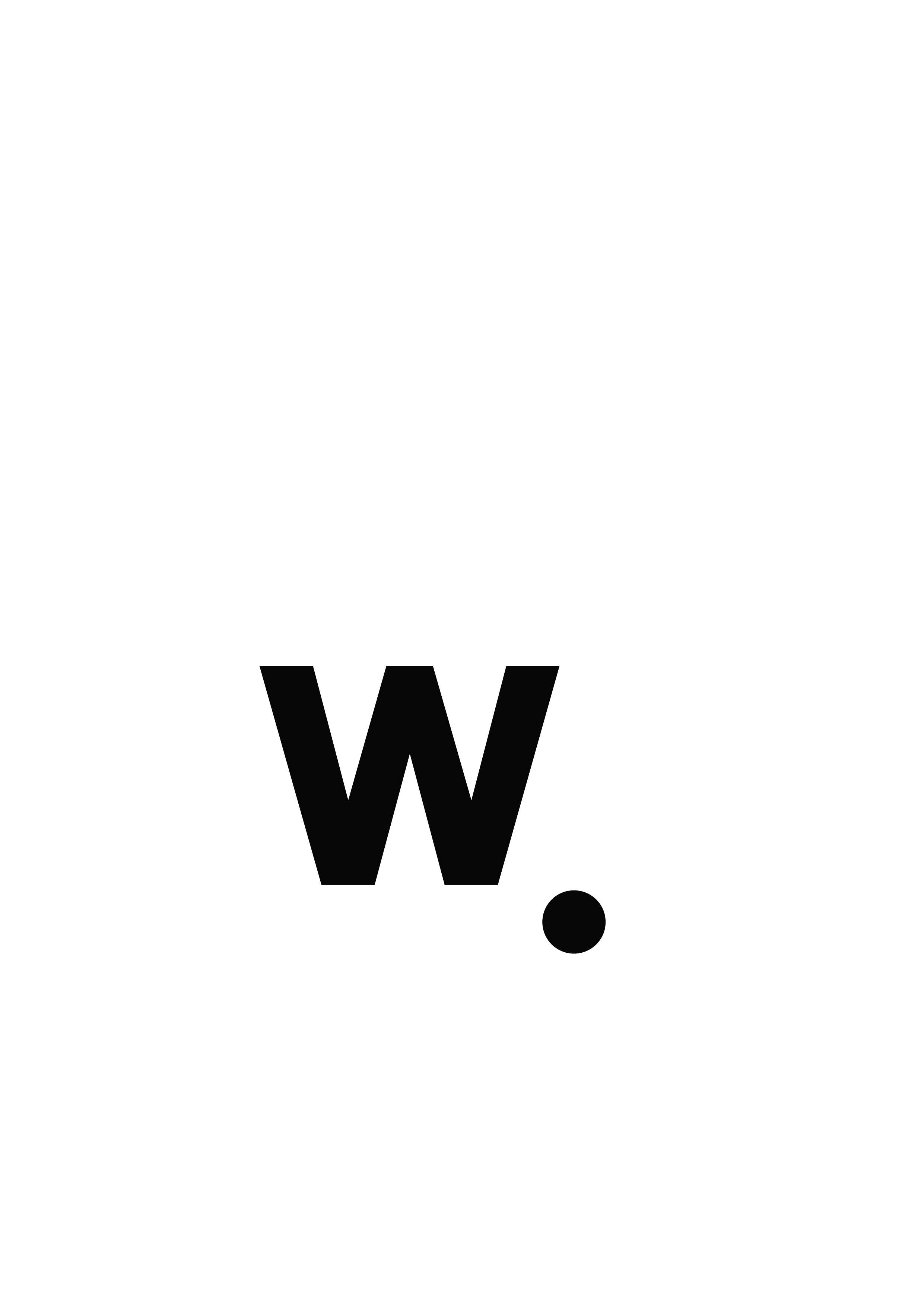
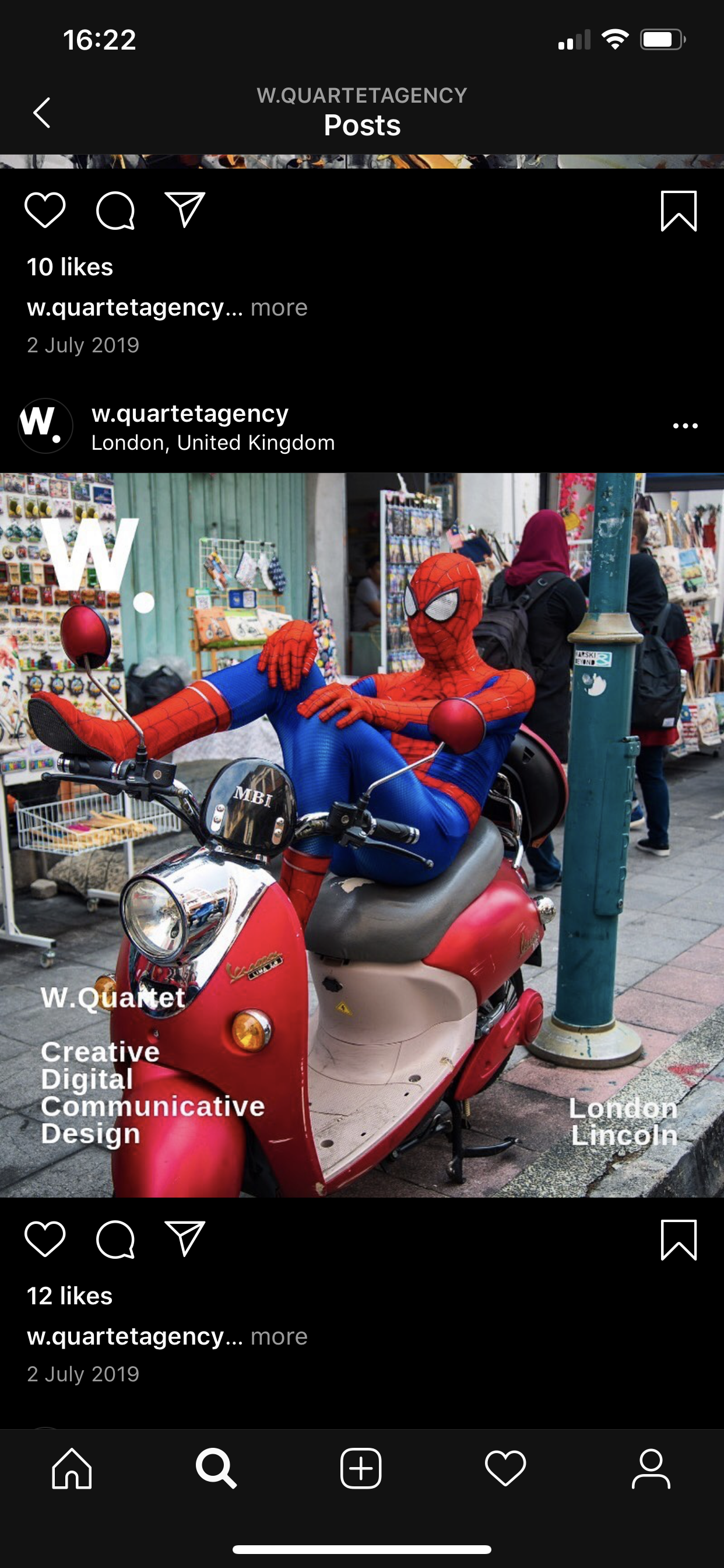
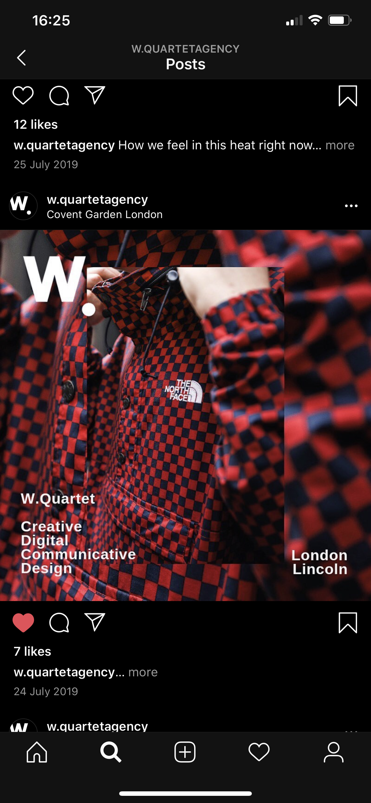
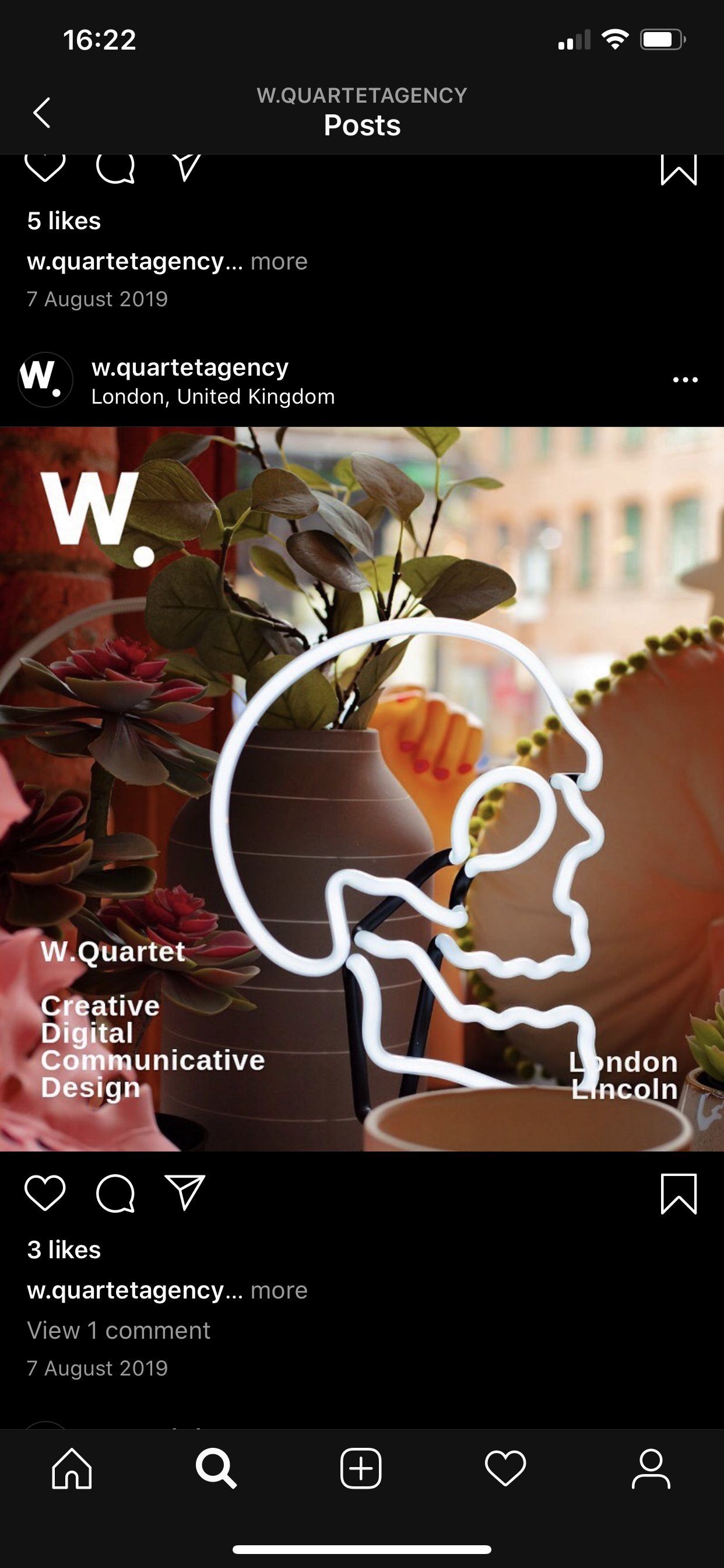
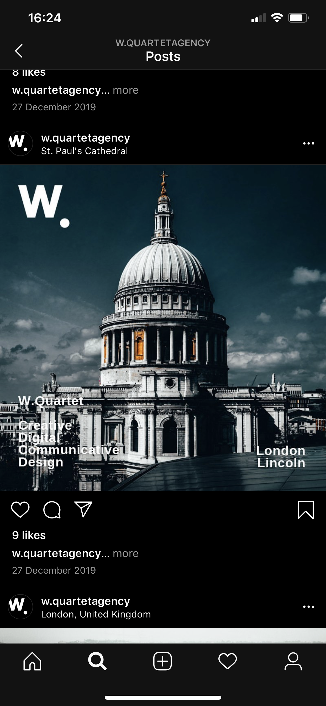
W Quartet is a creative branding agency that gets strait to the point working with forward thinking brands and companies who want their message heard through different forms of digital media. They believe that every brand has an interesting story to tell, and those stories should matter. For this logo I was tasked to create something that was clean, contemporary, versatile & simple. At first the idea for the logo was to try and encapsulate what the agency does but it was starting to complicate the design of the logo. The dot at the end of the logo nods to the agencies ethos of getting right to the point, the core of the problem presented and providing a tailor made solution for the company, person or organisation. The dot is almost like how some people end signatures, this logo is personal it is the owner putting their name on the work.
